In this article, we will discuss What Is A Box Plot In Statistics? and we’ll explore all aspects of the box plot.
- Starting with a single value the median.
- Progressing through the simplest box plot possible.
- Finishing with a notched box violent plot with two types of confidence intervals and statistical groups comparison.
- So at the end of this article, you’ll be able to understand every little detail of this plot.
What Is A Box Plot In Statistics?
Box Plot is a graphical representation of data distribution. Box plots are useful for visualizing distributions of numeric variables. In a boxplot, each observation (or data point) is represented by a small square whose height represents its value and width represents its variability. A horizontal line inside the box marks the median value of the observations while whiskers extend to the minimum and maximum values excluding outliers. Outliers are points outside the range defined by the upper and lower quartiles.
Example
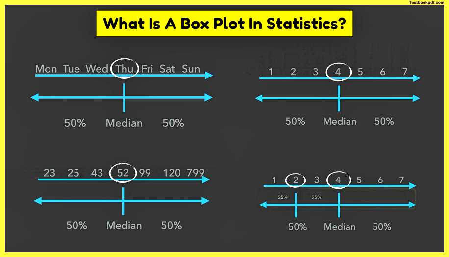
Let’s start with a simple example of data there are seven days in a week three first days are the heaviest because we have to work while the last three days of the week are the easiest because we approach and enjoy the weekend Thursday is in the middle of the week and is neither heavy nor easy it’s just central and that’s exactly what the median is a central value or the value in the middle this means that there are exactly fifty percent of days before the median and fifty percent of days after the median.
If we describe our weekdays in terms of numbers day number four would be the median and it doesn’t matter how different or strange the numbers are if they are ordered the median is always in the middle you may have noticed that 7 is an uneven number which makes it easy to pick the median what if we have eight days which is even well you’ve guessed it we just take the average of two numbers in the middle
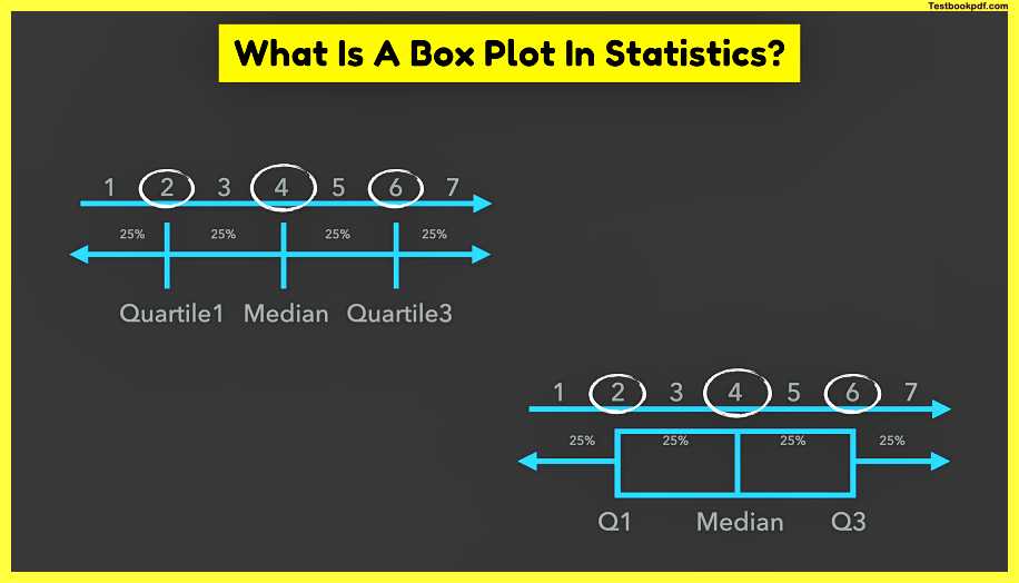
Now the left 50 of the data can also be split in half so that 2 becomes the median of the left half of the data this splits 50 into two times 25 or two-quarters of the data where the line in between the first and the second quarters splits the whole data set into two parts 25 on the left and 75 percent on the right separating the first quarter from the whole data set gave this line its name the first quartile similarly the median on the right half of the data is six and the line which has three-quarters of data on its left and one quarter on the right is called the third quartile since our median has two-quarters of data on its left it can actually be called a second quartile this name makes total sense and it increases understanding of the box plot but it’s somehow rarely used most often the first and the third quartiles are shown as q1 and q3 and they’re always connected by lines.

so that if we connect the quartiles and remove some unnecessary details we’ll get a box that contains 50 of the data and is responsible for the name of the box plot such a horizontal box plot beautifully shows how the median and the quartiles originate from data.
Vertically Box Plot
But most of the time box plots are displayed vertically here the thick red horizontal line in the middle of the box is the median which divides all data in half and else the data inside of the box in half
so that both sub-boxes have 25 percent of the data even if they look completely uneven the first quartile or q1 is the lowest horizontal line or hinge of the box which as we just learned is greater than 25 of data and smaller than the other 75 of the data it is also known as the lower quartile the third quartile or q3 is the highest horizontal line or hinge of the box and it is larger than 75 percent of the data and smaller than the remaining 25 of the data it is also known as the upper quartile box length also provides useful information because the box contains 50 of the values since these 50 of the values range from the third to the first quartile the length of the box is often called interquartile range or IQR.
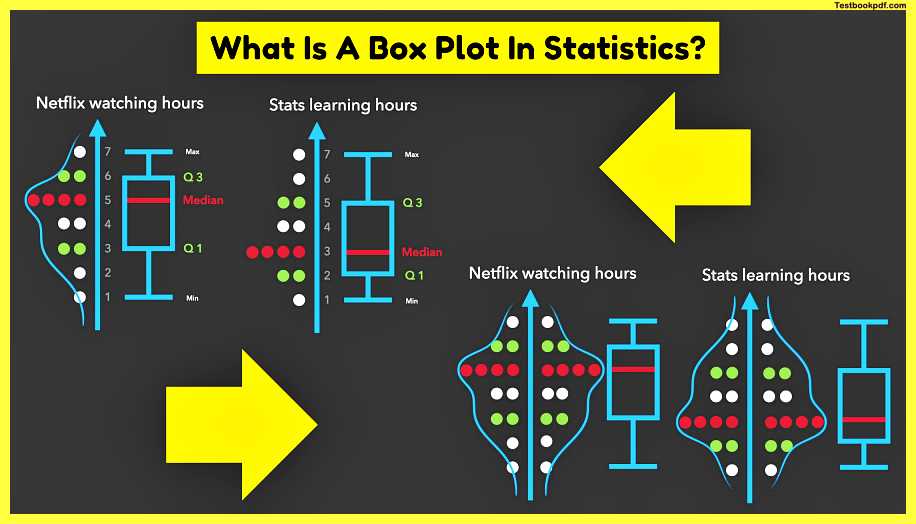
so the interquartile range is the distance between the upper and the lower quartiles whiskers show data variability outside of the box with the maximum sitting on the end of the highest whisker which is often called the 95th percentile maximum is the largest data point excluding any outliers and the minimum sitting on the end of the lowest whisker often called fifth percentile minimum is the lowest point excluding any outliers
so you see that every box in the whisker plot displays the so-called five-number summary of a particular sample the five-number summary contains the maximum the third quartile the median the first quartile and the minimum the numbers on the vertical axis are usually displayed as points.
Interquartile Range
The interquartile range is one of the most interesting tables here despite the fact that it does not include the whiskers it determines how long can whiskers be by the way are both whiskers always equally big and symmetric the answer is no how long should viscous be well a whisker is drawn up to the largest observed point from the data set so if the maximum is higher the whisker can be longer but how long can it be infinite the answers again no only one and a half times the interquartile range but what if a data point goes beyond this distance you’ve guessed it such that a point becomes an outlier similarly a distance of one and a half times the interquartile range below the lower quartile contains the minimum data point are all data points behind these instance outliers actually not if this distance surpasses three times the interquartile range the point becomes extreme and should definitely be excluded from the data set but what about outliers should they always be excluded it depends sometimes outliers are the most exciting data and delivers valuable insights thus we need to understand the reason for the data point being an outlier before removing it.
Example of data and construct
the box plot around it how many hours a week do people usually watch netflix i ask 16 people most of them watch netflix for 4 hours a week these are approximately 4 episodes of a tv show but when i thought about my netflix habits and habits of my friends the picture shifted towards 5 hours a week it’s kind of a lot but i thought it’s okay because i was sure i put the same effort into learning statistics however after being a bit more honest to myself i realized that i spent much more time on netflix than unlearning as you can see the data on the left is distributed a bit differently than the data on the right which can be shown with a smooth line on the top of the data and in order to emphasize this difference even more we could mirror the data and its distribution on the other side of the axis since the distribution curve shows the same as the data we can actually remove the points in order to declutter our plot without losing any information this would leave us with a violent plot which aims to show the distribution of the data whether it is normal or skewed and to emphasize where the most of the data are namely at the widest part of the violin interestingly the box plot with its five number summary and the violin plot with its distribution are often shown together in the form of the elegant and very informative box violent plot.
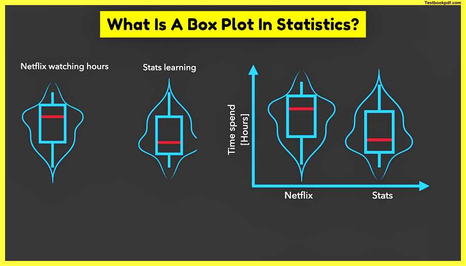
which not only tells us a lot about each of the samples but also allows us to compare them and see whether they are significantly different or not how do we compare to samples well we can start with comparing their medians but comparing only two numbers is certainly not enough to be confident about whether medians are really different thus we need some kind of measure of certainty or measure of confidence about our medians such measure of confidence is actually the confidence intervals of the medians.
let’s calculate them step by step
we’ll start with something we already know the interquartile range which is the difference between the third and the first quartiles we then multiply the interquartile range by 1.57 and divide the whole by the square root of the number of observations in the sample adding and subtracting this whole expression to the median would give us the notch which shows the approximate 95 confidence intervals of the median.
so if we plug in the numbers 4 for the median 6 and 2 for the quartiles and 6 and 4n and then simplify the equation we’ll finish up with the two numbers which are equally far away from the median.
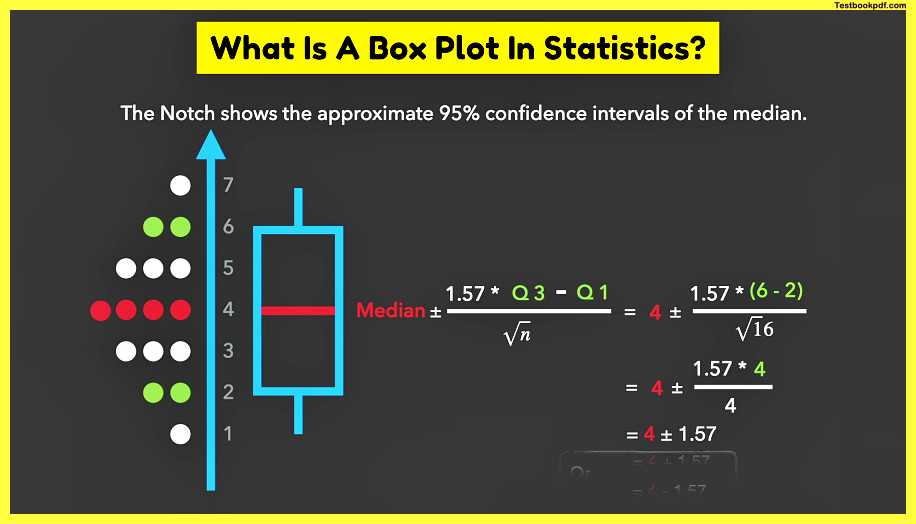
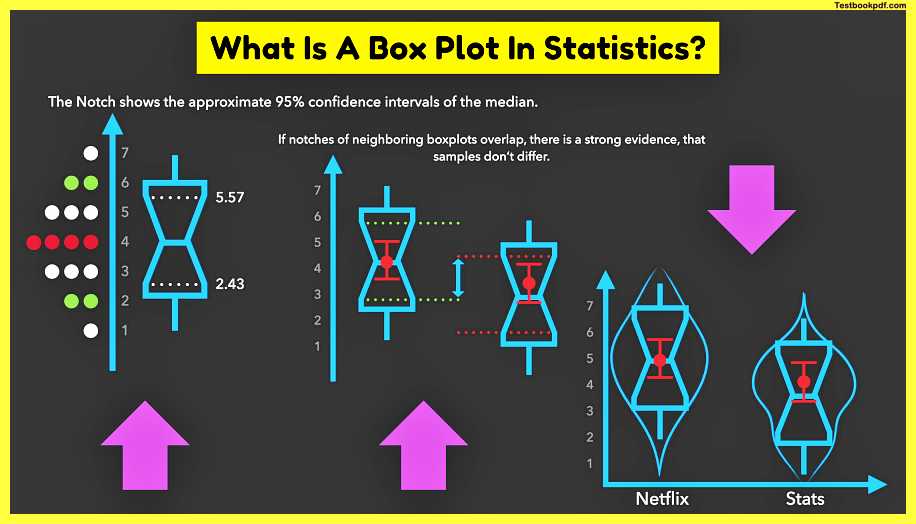
The first one is 5.57 and the second one is 2.43 denotes are usually displayed as a narrowing of the box around the median you have most likely seen the node displayed in this way before
But now you know exactly how they originate small sample sizes often result in larger confidence intervals than the box itself, in this case, it is not recommended to take such confidence intervals seriously good statistical programs for example will even warn you about this thus it’s recommended to always provide the sample size and avoiding notches unless they fall entirely within the interquartile range
So how is the notice useful well in general if notice of neighboring box plots doesn’t overlap there is strong evidence that samples significantly differ we can use this in informal discussions or for getting intuition about our data however we need to conduct a proper statistical test to be sure similarly if notice of neighboring box plots does overlap there is strong evidence that samples don’t differ it’s also often useful to display the average on the box plot because it helps to visually estimate the normality or skewness of the distribution particularly if the average is not far away from the median the data is most likely normally distributed however if ever it is far away from the median such data would most likely be skewed the means can also be extended with 95 confident intervals in order to communicate more information about samples in roughly the same amount of space?
So if we put together all we have learned so far we’ll end up with a pretty informative plot we chose the box plots with five number summaries the notches showing 95 confidence intervals for the medians the means with 95 confidence intervals and the violent plots displaying the distribution
Now let’s have a look at the real-world data and build our box plots around it from scratch step by step
Here we can see the salary of two different working groups on the left are industrial or factory workers and on the right are the i.t people or information technology guys my very first trick in understanding the data is to always visualize it we see that I t people earn the kind of more but we can’t say for sure from the data alone.
So we need some numbers for it for this we put box plots on top of the data to display the five number summary the box plot on the left perfectly describes the data where maximum and minimum or whiskers cover all the data points the right box plot however has three outliers which are most likely some machine learning experts and out of the pure interest of what they earn We can tag them to see the real values the violent plots and the means tell us a lot about the distribution for instance we can see that the left plot is normally distributed because first the violin looks symmetric or like a bell and secondly the mean sits right on top of the median in contrast the right box plot is skewed and does not look like a bell curve and the mean is far away from the median which means that the data is not normally distributed namely most of the i.t people earn similar to the industrial workers but several of them earn more since one of the samples is not normally distributed we need to compare the medians of these samples instead of the means.
So we add the notches and see whether they overlap they do overlap but very slightly.
So we need a proper statistical test with a p-value in order to be sure whether the salaries between these groups differ or not sometimes it is useful to display some numbers such as mean and confidence intervals.
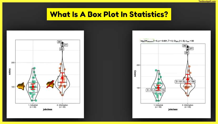
So we don’t have to guess them by staring at the y-axis a Wilcoxon test compares the medians of these samples and provides the p-value in our case the p-value is small which means that people have a significantly higher salary than industrial workers in the next article I’ll show you how to easily compute such complex box plots in r in a single line of code having only three arguments data x and y and how to enrich box plots with the results of most useful statistical tests.
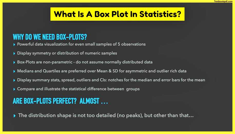
Why do we need Box Plot?
let’s summarize all the usefulness of the bug splats.
- Box plots are powerful data visualization techniques for even small samples of only five observations.
- They are displaying symmetry or distribution of numerical samples.
- Box plots are non-parametric so they do not assume normally distributed data.
- Besides medians and quartiles are preferred over the mean and standard deviation for asymmetric or outlier-rich data.
- The box plots can also display summary stats of these spread outliers and confidence intervals for example notice the median and arrow bars for the mean.
- They also compare and illustrate the statistical difference between groups.
Box, Code, and Whisker plots
Box and Whisker plots are a way to visualize data in a simple and intuitive manner. Box and whiskers plots are commonly used in scientific research and have been adopted by many software developers. In statistics, they are often called box-and-whiskers plots after their resemblance to boxes and whiskers.
The basic idea behind box-and-whiskey plots is to show the distribution of values in a dataset along with some indication of the central tendency (the median) and variability (the interquartile range).
A box plot consists of 4 parts:
- A box – shows the middle 50% of the data points.
- Whiskers – extend from each end of the box to the furthest point within 1.5 times the interquartile range. Points beyond the whiskers are considered outliers.
- Outliers – points outside the whiskers and above or below the box.
- Notches – indicate whether the data is normally distributed. If the notches do not overlap, then we can reject the null hypothesis that the data comes from a normal population.
In R, we can create boxplots using the following code:
library(ggplot2)
Load Data
Create Box Plot
ggplot(df, aes(xreorder(Var1, Var2), yVar3)) + geom_boxplot() + labs(title”Box and Whisker Plots”)
If you ask me if the box plots are perfect?
I would say almost because the distribution of the shape is not too detailed there are no peaks in the violent plot but other than that they are almost perfect.
